Final Group Project Commentary

This Final Group Project was therefore one of the toughest, time consuming project that I have ever done in my 3 years of NUS life and I am grateful for this challenge! I will be reflecting and sharing about the Final Group Project in 5 portions:

1. Research for Critique

2. Revamp of our Topic and Project Process

3. Presentation & Critique Prototype

4. Design Document and Final Prototype

5. Self-Reflections

1. Research for Critique
I established contact with my group members and I created a Google Folder to share our current first insights into what topics we would be interested in doing. I suggested two ideas, one on online dating and one on different dance trends. I picked dating in Singapore as it was interesting and it was something that I have been working on in my part-time internship — where I found out more about the offline dating platform Gaigai. As for the different dance trends, being a dancer made me interested in exploring the history of it and hence I suggested these two topics and gave recommendations on what content we can put for each page. My group members also suggested other topics such as travelling and fashion trends, and we decided to proceed with fashion trends after a discussion. We worked on fashion trends for the Critique Presentation and split our work according to the year (I chose 1970s), and researched on the different unique features about that era, the vibes and the female representative of that decade as well.
However, upon presenting our idea to the class during the critique presentation and gathering feedback, we found that our topic did not have a clear proper flow that we envisioned previously, and we struggled with the feasibility of the designs turning out visually appealing, Hence we decided to take a leap of faith and have total revamp on this topic after a discussion with Professor Kai En.

2. Revamp of our Topic and Project Process
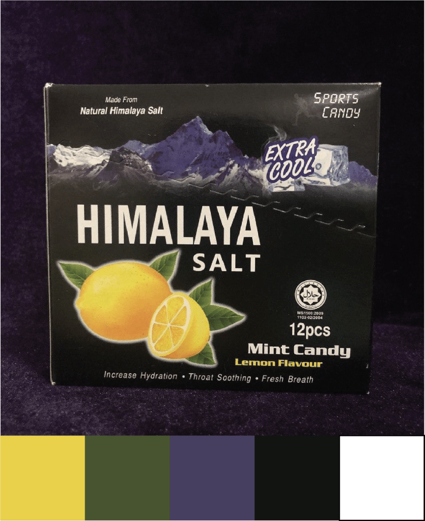
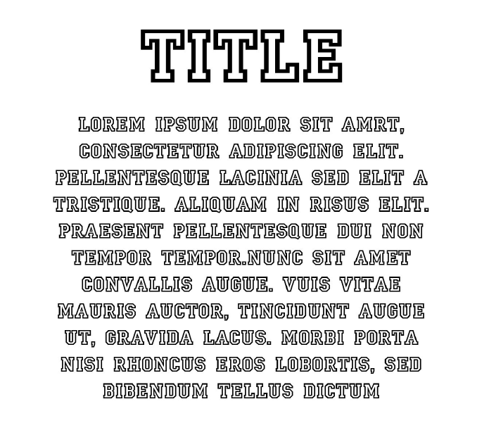
Since we did not have the critique presentation to guide us, we created another presentation for Professor Kai En to look at and give further feedback where we embarked on the topic Online Dating in Singapore. When doing our research and collecting all relevant information about the topic, we refined our target audience to be strictly for women so the flow would be clearer and more targeted. After we received comments from Professor Kai En, we went ahead to do up the prototype, presentation and design document. Sarah was in charge of the design prototype as she volunteered and said it would be easier to coordinate if she worked on it herself. The rest of us distributed the work for the presentation and design document, and also split between the 3 of us for the research on the specific information that we would like to put in the document, including the copy-writing for each page. It was important to gain inspiration from other designs that managed to make information flow seamlessly, hence we also worked on how each page would look, discussing the overall layout and having a rough sketch. We tried to emulate the same seamless flow that some eBooks have successfully achieved, and we wanted to have an extremely cohesive eBook where each page were similar in design, but had its unique visual elements that makes each page special. We also utilised only 4 colours throughout the entire eBook, and still managed to create a design prototype that is energising yet cohesive looking.

3. Presentation & Critique Prototype
We worked on the presentation together while Sarah worked on the prototype. Sarah met a roadblock for the route map page so I took over for that portion to edit it and completed it. However, I made a mistake of not saving it frequently and hence my computer crashed after I completed the two facing pages. Fortunately, I managed to take a screenshot of my work to have it placed in the presentation slides. However, it would also mean that I would have to redo it for the final prototype as well.

4. Design Document and Final Prototype
After the critique, we received feedback that some of pages were too wordy and could use more graphics to display our information as well. This would mean that we would have to ensure that all our copy-writing material was shortened but still presented the same amount of quality information. Yan Ling transferred the pages from Illustrator to InDesign, while I redid the copywriting required for the pages that were too cluttered with information. Yan Ling and I worked together to refine the design prototype in terms of the alignment of the columns, creating more graphic vectors using Adobe Illustrator and effectively placing the different elements onto the document such that it has a neat structure and is easy for the audience to read and understand. We also attempted to apply more design principles into our design through having contrast for certain graphic vectors and playing around with layout of the design prototype.

Something interesting I learnt was that Yan Ling and I utilised different versions of InDesign (mine was 2020 while hers was 2019) and this resulted in a technical issue whereby she was unable to open my file. Fortunately, upon researching, all we had to do was to save the inDesign Document as IDMI (which stands for InDesign MarkUp) and this would allow the design prototype to be compatible with both of our versions of InDesign.

Our group had a few meetings to discuss the amendments of the design prototype as well as the content of the design document, and we were finally satisfied with our work! 🙂

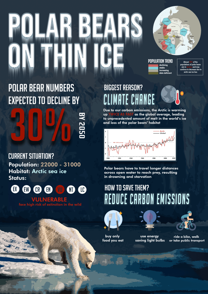
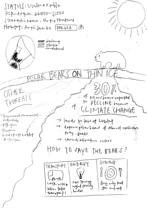
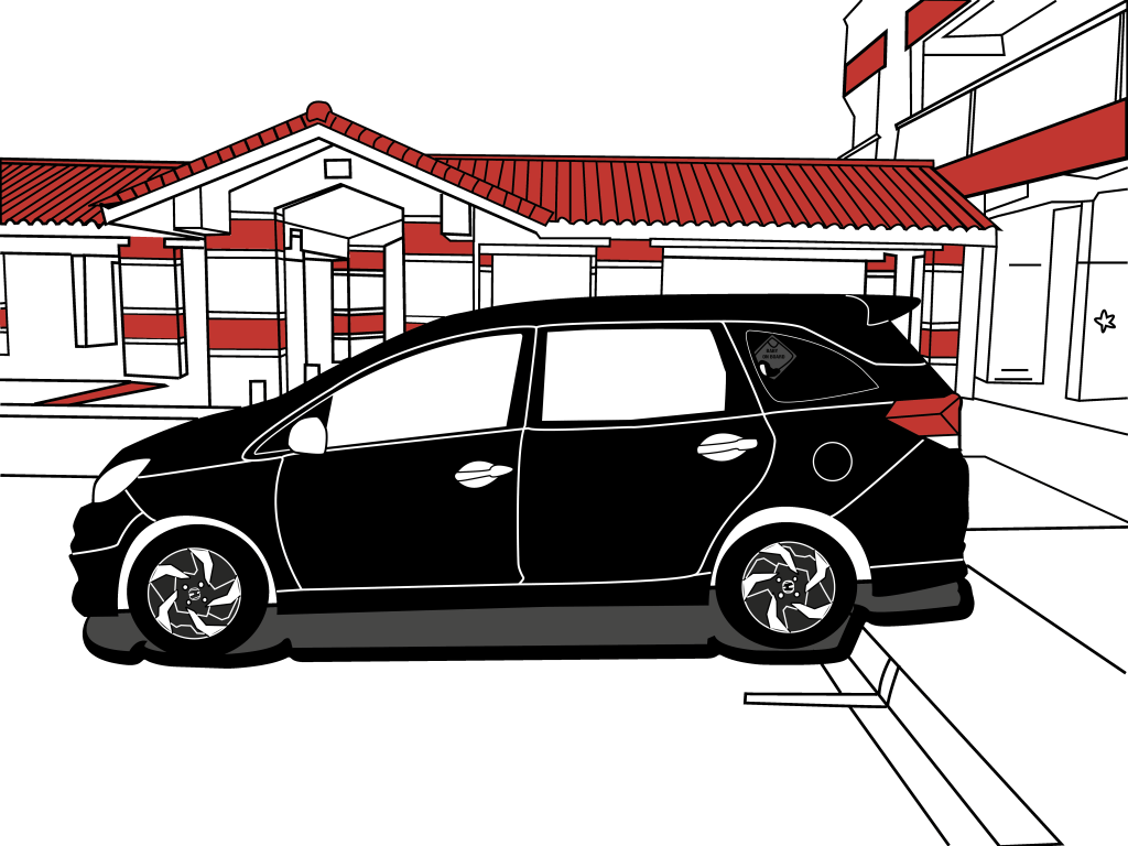
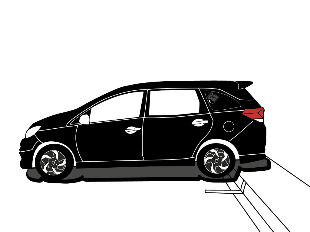
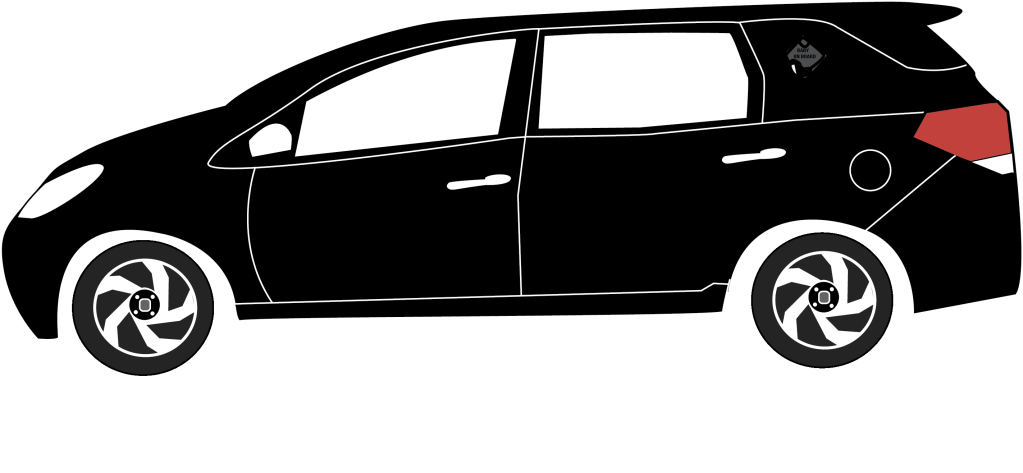
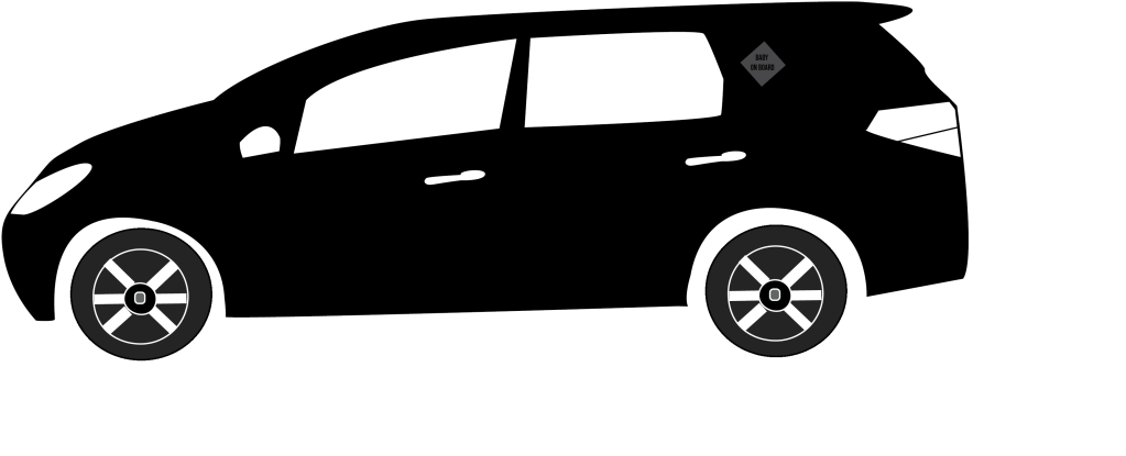
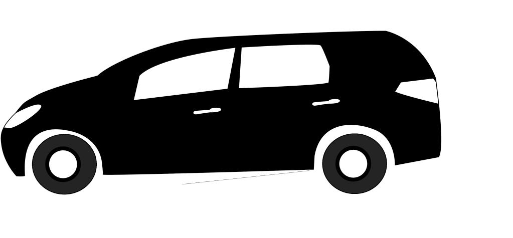
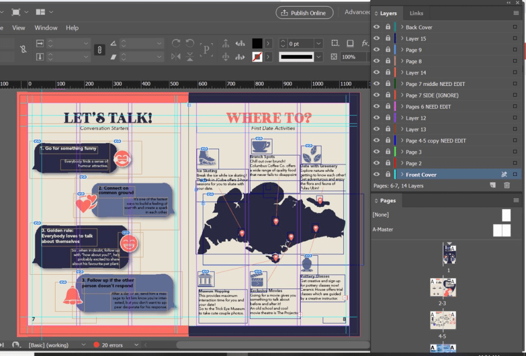
This is a screenshot to show how we utilised Adobe inDesign for our layout of the prototype and create a clear structure for our entire eBook.

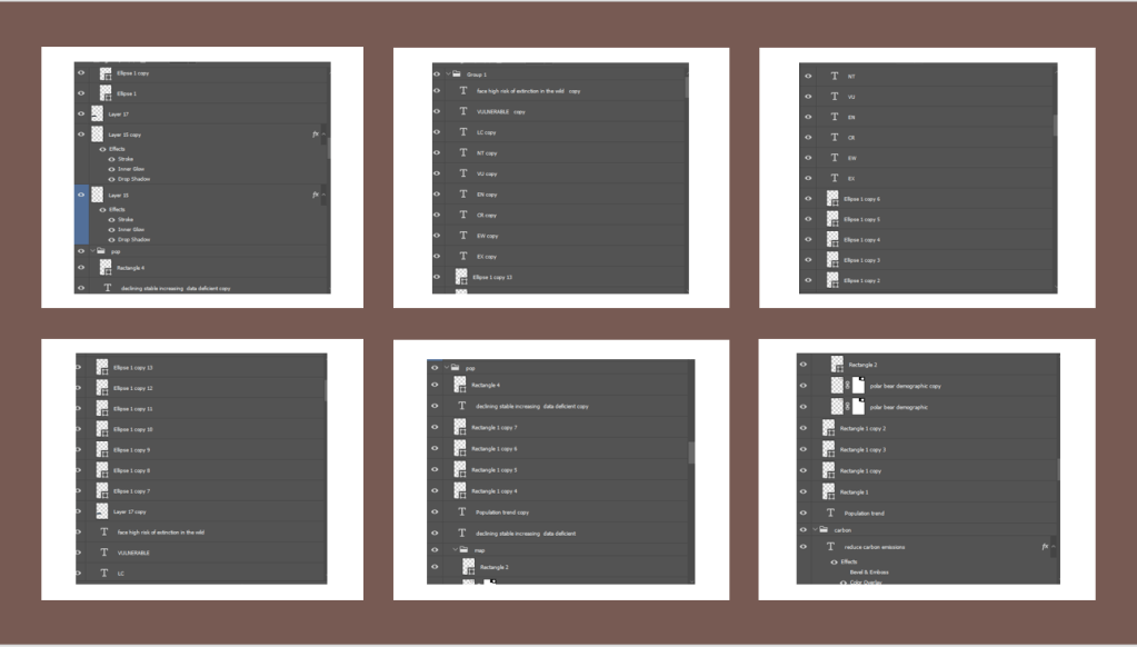
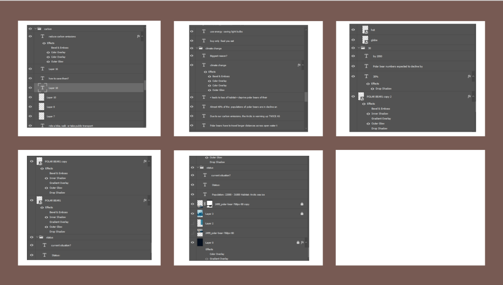
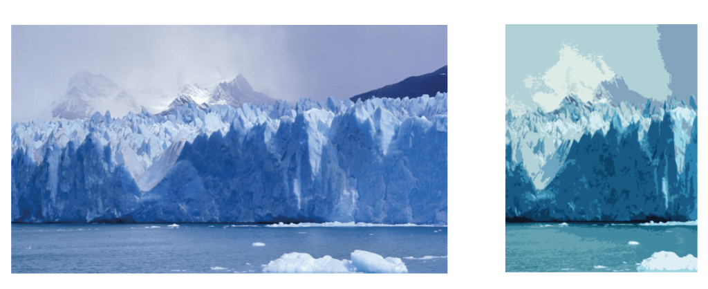
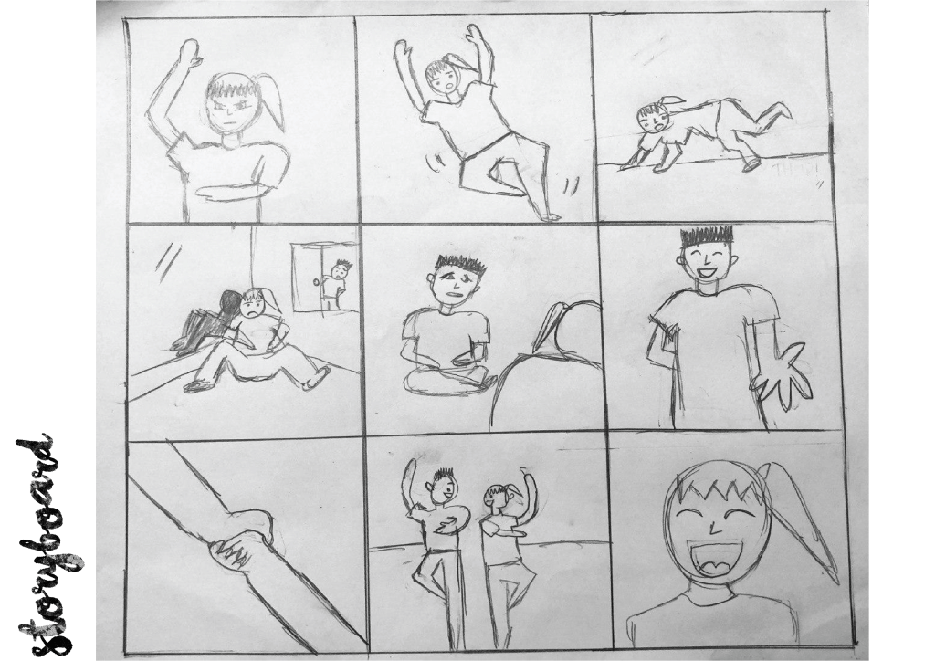
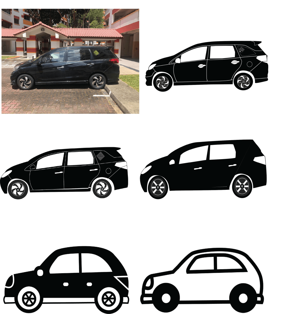
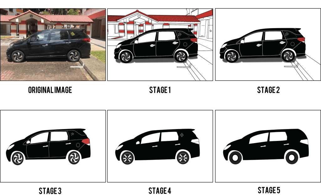
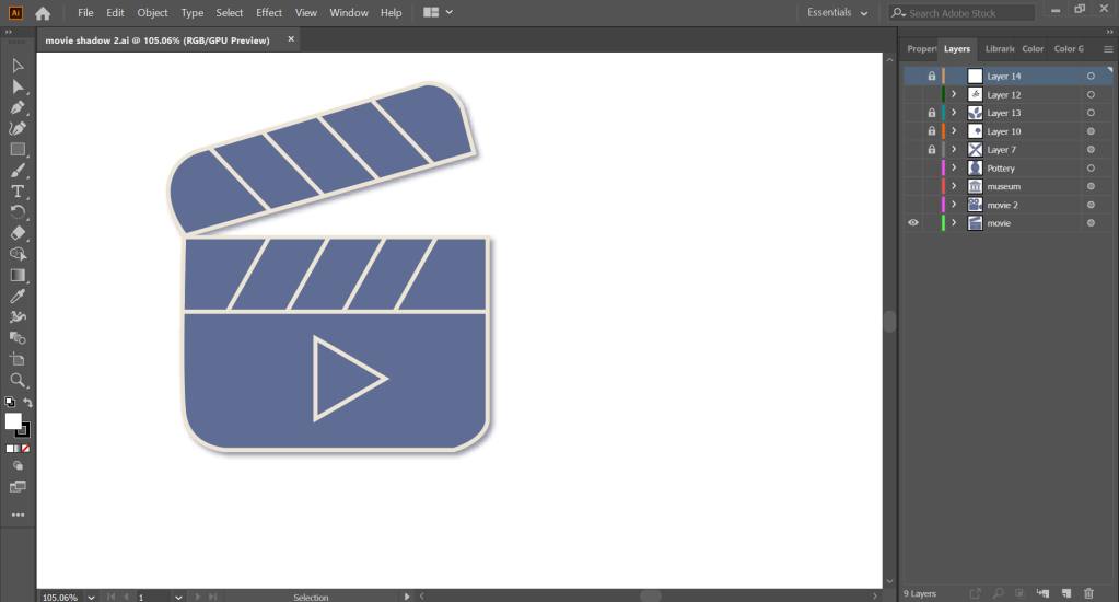
This is also to show that we utilised Adobe Illustrator to create our graphics from scratch by drawing using the pen tool.

5. Reflections

Having different design visions was something very difficult to reconcile, and we all had to work together to create something that we were all in agreement of. On hindsight, I should have been more insistent on the manner we split the workload, where it was either one person doing the graphics while the rest worked more on the inDesign layout, or everyone collaborating and ensuring that our graphics were similar in style while we worked on our individual pages.

The current COVID-19 circuit breaker situation also hindered us from physically working together, which made communication extremely difficult as well, as we had to work separately from our homes. This was not an ideal situation, but I am glad my group managed to work these through together.

Through this project, I have also learnt to use inDesign to create a more structured design and ensure that information are presented in a manner that is easy to read. I think my group did well in ensuring that the eBook looks visually cohesive and the flow of information was executed well too.

Overall, I think my biggest takeaway from working on this project was to have better communication when trying to convey my ideas to my team members. Given how our mode of communication was mostly online and through text, I could have better phrased what I was trying to convey and be more aware of how the other person would feel upon receiving the messages. I made a mistake in being unaware of how my messages were presented, and the intentions of mine were not properly conveyed. This resulted in a miscommunication that led to a conflict. This is definitely something I will work on diligently to improve myself and I will ensure that this conflict will not happen again in the future.

In Lecture Exercise G

This is the pattern of the shape circle, and it is the lightest at the top left and becomes darker till the bottom right 🙂 Patterns are definitely an interesting visual element that can be applied to backgrounds of images to create more visual excitement and also bring the creative work to life.

Assignment 3 Commentary Final

FINAL WORK

The following are the layers as requested, and you can see how I utilised Adobe Photoshop to construct this infographic.

I wanted to reduce the amount of text that was in the infographic as I felt that it looked rather wordy after including more information, hence I decided to utilise the IUCN Red List to show that the polar bears are under the ‘Vulnerable’ status and shows where on the scale it is on, giving more information on its current situation.

This was how I presented the data, to show how polar bears are a vulnerable species and face high risk of extinction. I placed a faded blue box in the background so that this image was more visible.
BEFORE EDIT

FROM THE CRITIQUES, I HAD TWO OVERALL COMMENTS:

  1. Not enough link between reducing carbon emissions, climate change and the decline of polar bears.
  2. Jarring fonts of ‘Reduce Carbon Emissions’ and ‘Climate Change’

With the comments given, in order to tackling the problem of 1. Not enough link between reducing carbon emissions, climate change and the decline of polar bears, I decided to include more information with regards to the link between carbon emissions and the decline in polar bear numbers.

I decided to include a graph as suggested by Mr Kai En to show how the arctic is really warming twice as fast as the global average and to show the differences visually through this graph.

I also changed the text to make the connection more visible – one can see how the direct impact of not reducing carbon emissions can lead to polar bears dying of drowning and starvation and hence the decline of numbers.

This is the flow of information: Not reducing carbon emissions > Increase in global temperature, and especially arctic temperature > [shocking fact and graph to show severity] The Arctic temperature is warming twice as fast as the global temperature, which is not a good sign > Leads to the melting of the sea ice > Polar bears heavily relies on sea ice and it is their habitat > Results in a loss of their habitat > Polar bears have to travel way longer distances to reach their prey, leading to drowning and starvation.

To make the information clearer, I also included a text to explain the population trend on the world map to give more context and relevance to how there is a decline in some populations of the polar bears.

As for the comment on the fonts 2. Jarring fonts of ‘Reduce Carbon Emissions’ and ‘Climate Change’, I changed the typeface that I used, using the same font that I used for the ‘questioning’ header of ‘Biggest Reason?’ and ‘How to Save Them’. To differentiate and make it less incompatible, I increased the text space between them and italized it. Hence, I omitted the use of the font RocketToInfinityW00, and only utilised two fonts in this infographic overall.

Assignment 3 Commentary [Part 2]

This was the Infographic I came up with for the first critique 🙂

For the infographic, I wanted to focus on the main reason why polar bears’ numbers might shrink drastically (30%) by the year 2050 and raise awareness about climate change affecting the polar bears in a detrimental manner. I would also like the audience to understand the importance of making effort to reduce carbon emissions, and listed ways one can do their part.

The comments from the previous critique included the fact that I should focus on the cohesiveness, which is why I deviated quite a bit from my rough sketch as I wanted a cleaner and more organised look of the infographic.

FLOW: The natural flow I would like my audience to read in would be left to right in a downwards manner. I also positioned the bear to be at the bottom instead of the top and the center as it looked cleaner. 

FONTS: I chose mostly block fonts to symbolise ‘blocks of ice’, especially for the headline. I used the filter of wind on the headline ‘Polar Bears on Thin Ice’ to emphasise the effects of melting ice, as a form of art element. I used BigNoodleTitling, RocketshipfromInfinityW00 for the headers and Futura Hv BT for the body text.

COLOUR SIGNIFICANCE: I utilised the colour red on specific words to highlight the decline of  polar bear numbers, as the colour red stands out and signifies danger,  and is especially utilised in warning signs.  The dominant colour I utilised is blue, which is the colour of water (shows ice (white) melting into water (blue)). The infographic is also in mostly dark shades of blue to signify the seriousness of the issue and give off a depressive ‘vibe’ to the infographic. 

ADDITIONAL COMMENTS: I omitted the information about other threats that could lead to a decrease in polar bear numbers (eg. pollution, disease, increased commercialised activities etc) as I felt that it did not directly link to the message I was trying to bring across, which is that climate change is affecting polar bears, and that we should take action.

EXPLANATION OF HOW I DID THE INFOGRAPHIC
I utilised the software Adobe Photoshop to help me construct the infographic. I first created a background layer [dark blue] so that it sets a tone for the entire piece.
For the bear, I utilised the eraser tool to crop the portion that I would like to keep for the infographic. After that, I used ‘poster edges’ under the tab ‘filter gallery’ to create a more digital form of image of the polar bear and also content aware scale to stretch out the background of the water that is melting.

This is for the background. I toggled with the hues and saturations and played around with the Photoshop tools to achieve a more cohesive tone with the bear and background. I also cropped the image to use for the background, and tweaked the opacity so that it will not be too overbearing as the background image.

I first converted the words into a Smart Object and then rotated the text clockwise by 90 degrees, and under the ‘Filter’ tab, went to ‘Stylise’ and applied ”Wind’ 3 times. I then added all the other effects under ‘Blending Options’, which includes Bevel and Emboss, Inner Shadow and Outerglow.

COMMENTS CRITIQUE: [these were the comments given by my peers and Mr Kai En]

Sneha: I really loved the background design, it really supported the message that you were trying to get across! I did feel that the design of the text used for “climate change” and “reduce carbon emissions” can be swapped because it takes away attention from the other titles, it takes a while for the audience to see the links between the message and the call to action.  I think more information on the decrease would help, like by showing the connection between pollution and climate change then linking it to the decrease in polar bears.  Overall good job! 

Kai Jing: I think the population trend could be made bigger! Maybe don’t need to show the whole globe, you can enlarge it and place it at the corner. But I am not sure if this would create imbalance to the overall. And I think the alignment of the reduction of carbon emission is okay! [when I was trying it out, there were issues with regards the imagery that I pictured!]

Also I think there can be more information. The current information doesn’t really value add to current  common knowledge, and I don’t really see the link between how we can do something to slow down climate change. Maybe can explain more about climate change, that it is raise in temperate and melting of ice that causes the stuff that you mentioned! So readers can see a clearer link in how saving energy reduces carbon emissions (which is linked to climate change).

Amanda: I think the illustration of the polar bear is really nice and the overall color scheme works! I think this is a topic with very impactful and shocking numbers regarding the decline of polar bears and I like how you made the statistics very striking to capture the audience’s attention. However, I think the font colour for “30%” and “vulnerable” is a little too dark. Perhaps you can make it a little more contrasting with the background so that it is even more striking. Also I think the “population trend map” can be blown up a little bigger! Overall, the flow of information works really well and the visuals work well to support the information and statistics! Jiayous!

Mr Kai En: Sneha and Boon Jing hit home with their comments, and I am of the same thinking with what they had mentioned. Overall the visual is working well, but the communication of the infographic needs to be tightened further – look into how else to incorporate further data or insights to help add value to this piece of work (Sneha suggested a showcase on the decreasing number – I think that would help and perhaps you could use a chart to showcase dwindling numbers). Also, while I appreciate the dynamism of the typeface used for “climate change” and “reduce carbon emissions”, I am not sure if they are quite working as I feel that it can be rather distracting to the whole composition and that it stands out in a jarring manner 🙂

Assignment 3 Commentary [Part 1]

I have decided to do my infographic on polar bears and the effects of climate change on its decline as I felt that it was very visual way to see the direct impacts of climate change, and given that many people have a soft spot for animals, especially polar bears, this would cultivate more emotions with regards to this issue and drive more action towards preventing global warming from worsening.

These are the information I decided to include for the infographic.

Brief Summary
Status: Vulnerable •Population: 22000 – 31000 •Scientific Name: Ursus Maritimus •Weight: 800-1300 pounds •Habitat: Arctic sea ice •Length: 6-9 feet
[Source: https://www.worldwildlife.org/species/polar-bear%5D

Polar Bear Subpopulations
[Source: https://arcticwwf.org/species/polar-bear/population/%5D

Focus on sea ice loss from climate change

•30% of the population expected to decline by 2050 •Polar bears have high dependence on sea ice •Shrinking Arctic ice cover is increasingly depriving them of their almost exclusive prey, seals •Process of eating seals: To minimize their energy consumption the bears still-hunt, waiting for the seal to surface when the bear stuns it, bites it on the neck and drags it onto the ice. •Cannibalism: Cases of polar bears killing and eating each other are on the rise in the Arctic as melting ice and human activity erode their habitat
[Source: https://polarbearsinternational.org/climate-change/status-endangered-polar-bears/, https://www.nationalgeographic.com/news/2018/02/polar-bears-starve-melting-sea-ice-global-warming-study-beaufort-sea-environment/]

How To Save Them?

Transport: Walk or ride a bike when possible and encourage friends, family, and colleagues to join you. Use public transportation likes buses, street cars, or subway trains.
Energy: Use energy-efficient appliances and equipment and turn appliances off when not in use. Replace light bulbs with energy-efficient LED bulbs
Dining: Buy and cook only what you’ll eat. Don’t waste food. (Currently, one third of all food produced is wasted.)
[Source: https://polarbearsinternational.org/get-involved/actions-with-impact/]

Threats to Polar Bears

•Biggest threat to survival: Sea ice loss from climate change
•Increased commercial activities
•Pollution
•Disease
•Inadequate habitat protection (of denning and seasonal resting areas)
•The potential for over-harvest
[Source: https://polarbearsinternational.org/climate-change/status-endangered-polar-bears/]

This is Preliminary Sketch 1
This is Preliminary Sketch 2.

I wanted to show that the polar bear is suffering from climate changes and these are my visions, where the polar bear is literally on a piece of ice and it is melting.

COMMENTS AFTER CRITIQUE

  1. Most preferred the first vision, where the polar bear is on the top of the ice
  2. To include the other threats portion first, and while doing up the infographic, see if there is significance for that as there is evidence of flow for the infographic as for now. Priority is cohesiveness.

In Lecture Exercise F

For this case study, we had to pick 5 hues and write about the mood they are conveying and if they are working well.

As a marketing student, I am interested to know how colours play a role conveying a message to consumers and influencing their purchase decisions, which is why I chose this image of the Himalayan Salt sweets that are incredibly popular in Singapore.

There is a great contrast between the dark black background and the yellow hues of the lemon, emphasising on the lemons as they stand out more and attracts the attention of consumers, and also show the detail that lemons are included in this sweet.

There is also blue utilised for the details of the mountains and ice, emphasising on the cooling effect of the sweet, and this complements the text ‘extra cool’, as blue is often used to communicate the idea of fun and is also a common colour that food industries utilise.

There is also a mix of a warm colour (yellow) and cool colour (blue) and black being the neutral background, creating an overall aesthetically pleasing look where there is no element that overpowers the other.

In Lecture Exercise E

For this exercise, we were given a typography case study and this was the image presented.

  • What seems to be off about this particular typographic representation?
    • The header and body has the same font, and this results in a less visually appealing look as there is no complementary typefaces being utilised here which does not enhance the quality of each other, and there is no variation in the fonts to contrast the design.
    • The body text is center aligned and this affects the readability of the text as there is no consistent starting point.
    • The body text is in all capital letters, which may be difficult to read and capital letters are usually utilised for headlines and not body text that may be lengthy.
  • How would you improve this typographic representation (look into the 8 rules for guiding points for discussion)
    • Rule 4 Readability: To change the alignment of the text to be left-aligned instead of centre
    • Rule 6 Hierarchy Matters: Utilisation of different fonts for the header and body text to guide the reader to read the text from top to bottom
    • Rule 3 Typeface Communication: Changing the font of the body text to one that is not completely capitalised, and one of sans-serif.

Assignment 2 Commentary

BEFORE CRITIQUE

This is the storyboard I have came up with:

For this assignment, we had to craft a storyboard and then execute it utilising photos to communicate a clear storyline. I decided upon this storyboard about dance as I am a dancer in Eusoff Hall, and my friends inspired me to come up with this storyline.

This storyboard is a sketch that I hand drawn and showcases what photographs I intend to take, and I titled it ‘It Take Two to Tango’.

The story is about how a determined dancer tries her best to practice, however as she was practicing a certain move, she loses her balances and falls. She feels demoralised after failing to complete the move, and sits in the corner of the dance studio, upset. Her friend spots her demoralised and was very concerned. He then decided to talk to her. After talking to her, he takes her hand to pull her up and they practices the dance together. The female lead, dancer learns how dancing is a journey, that is definitely easier and more fun when done together with a friend.

FIRST SHOT: My first shot taken is a mid shot, showing the dancer in preparation of the dance move she is going to be attempting to do. I chose to take this photo slightly to the side of her, as it displays her upright posture and also clearly, her face of determination to do well in her dance.

SECOND SHOT: This is shot 2, where I took at a canted angle to show dynamism of the main character and show her movement as a dancer. There is also a ”blurry’ effect to showcase movement as she executes the dance move, which is to pirouette. She has a shocked face as she is about to lose her balance while executing this dance move.

THIRD SHOT: For Shot 3, I shot from a top angle to show how vulnerable and weak she is as she falls to the ground from her imbalance. This angle shows contrast from the previous photo, as Shot 2 was shot mostly from the bottom-up canted angle. The female lead looks down as she tries to break her fall.

FOURTH SHOT: For Shot 4, the main character is disappointed with herself and sits in a corner, upset. The second lead peeks through the door and spots her. I used the golden ratio of a photograph and positioned her at the 1/3 of the photo, and I also utilised the mirror in the background to show the second lead looking at her to establish a relationship between them in this scene. I also utilised the reflection in the mirror to give more dynamics to the photo, as there is multiple perspectives of her at the corner of the dance studio, looking demoralised.

FIFTH SHOT: For Shot 5, this is when the second lead is concerned about her and approaches the main character, worried. They engage in conversation and I took this over-the-shoulder shot to establish the communication between the 2 leads, and I wanted to emphasise on the second lead’s expression which is feeling worried and concerned about the female lead.

SIXTH SHOT: For Shot 6, this is a close up shot from a bottom angle, showing the second lead reaching out his hand with a smile to the main character, offering to pull her up from the ground. This close up shot is done to show the male lead’s expression clearly, and from a bottom angle to show him being powerful, and is reaching out to help the female lead.

SEVENTH SHOT: This is Shot 7. This is a close up shot showing that the main lead takes his hand, and it emphasises on the relationship formed between the 2 leads in this photo. This implicitly shows that the female lead is willing to let the second lead help her up, after the talk and get back on her feet.

EIGHTH SHOT: For Shot 8, I took a long shot at eye level angle to show them dancing together in a dance studio and show them staring at each other smiling as they dance together, and succeeding. This further emphasises how the male lead was able to help the female lead regain back her confidence and figure out the dance move together.

NINTH SHOT: For Shot 9, I took a close up shot to show the happy expression on the main lead’s face. This shows the main character happy, a change in her emotions from demoralised to happy and satisfied, as she is glad that she managed to be able to do the dance with the second lead.

FURTHER DETAILS:
In order to make the shots more vibrant, I requested my friends who were nice enough to help me to wear bright, outstanding colours, which are yellow and red.

The female lead is wearing red as I wanted her to symbolise the fierce passion and determination required for dance, and as the main lead, draw attention to her immediately. As for the male lead, yellow symbolises positivism, hope and happiness. This is clear from how he helps her up and gives her motivation to carry on working on her dance.

I created this storyline as its meaning is very significant to me, as there are many a times, we feel alone when we are working hard, and we may feel that we work hard, yet do not reap results. However, with a community that helps and encourage you, working towards a goal may be easier than taking on the burden alone. Dance is an expression of self and it is very freeing, and I hope that as a dancer, I am able to improve, both by myself and also with my community.

UNUSED SHOTS

The following shots were taken but were not used in the final 9.

Here are the short descriptions of the photos (from left to right):

1. female lead turning on the music of the loudspeaker
2. different angle of taking her preparing to do the dance move
3. facing the mirrors to show her practicing diligently and checking her posture as she executes the dance move
4. mid-spin spot of female lead
5. long shot of female lead executing the dance move (without movement)
6. top shot that shows female lead on the floor
7. male lead half squatting instead of sitting down
8. a different hand holding (i realised that the hand stretched out in shot 6 was different from the one held in this shot, so i had to retake this shot)

COMPILED STORYBOARD WITH PHOTOS


CRITIQUE COMMENTS

  1. I received a pleasant comment from Sarah about how there were different close up and zoomed-out shots that adds dynamic to the storyboard! 🙂
  2. A possible way to improve would be to have more movement blur (since it is dance). However I do not own a DSLR, and there were some ‘movement’ on the second shot
  3. There should be the male protagonist in the last shot in the background (perhaps have a motive to get ‘her’) to make the storyline more interesting

AFTER CRITIQUE
I arranged with my friends to help me reshoot the parts that had feedback on. However, due to the COVID situation, the Hall Office has locked the Dance Studio when they typically do not do so, and my friends were unavailable on the other days to film except for that particular evening.  Thus I was met with the limitations of not utilising the same location and my friends’ unavailability.

I have notified Mr Kai En about this issue and he is aware of this situation.

Hence, in the following blogpost I will do my best to describe the two different shots that I would take differently. I have also added in the captions for what form of shots I envisioned to take eg. high angle, close up shot for both storyboards.

The following storyboard below is the first one with annotated captions.

Here is the edited storyboard, with frame 3 and frame 9 being altered.

CHANGES I WANT TO IMPLEMENT TO THE SHOTS

For Frame 3, I wanted to add more dynamics to the series of photographs, and give more variation of angles. Hence, I wanted to try out the all-encompassing, surveillance angle, which is the bird’s eye view from top down (different from the previous one which was just at a higher angle). The effect I would like to bring out would be to show the top view of the dance studio and the female lead being alone and small in the studio, making the contrast between the 3rd and 4th shot bigger, as there are two people involved in the 4th shot compared to one. It also gives the same understanding that the female lead is weak and demoralised on the ground, without anyone to help her.

As for Frame 9, according to the suggestions to bring in the male protagonist, I decided to utilise the mirror aspect of the dance studio again.

Instead of just a plain close up shot of the female lead alone, I will take a medium close up shot of both male and female lead with the female lead smiling and being situated closer to the scene shot.
The male lead will scratch his hand and sheepishly smile, but what is not seen by the female is that he crosses finger behind his back (as seen in the reflection of the mirror behind him that shows his back frame. The gesture of crossing of fingers indicates the desire for good luck –  mark a concentration of good spirits and served to anchor a wish until it could come true. I wanted to hint at the fact that the male lead had another motive behind cheering the female lead up, which is to also ‘chase’ her as he sees her as a potential dating candidate. The crossing of fingers indicate how he is hoping that his actions worked and he is able to get into her good books, leaving this scene open ended as we are not entirely sure about how the female lead actually feels about it – is it plainly platonic, or perhaps there’s a possibility for romance?

Assignment 1 Commentary

BEFORE CRITIQUE

This is the photo I have chosen for abstraction, which is a black 7-seater car. I wanted to present a visual objection of a car as I felt that there were many details about a car that we can look into and it can be easily shown as an abstraction.

I utilised the software Adobe Illustrator throughout this project. This is the Stage 1 of the abstraction, where I digitalised the car by using the pen tool taught to us during class. I included multiple details, such as the car wheels, the 3D side mirror and also the sign that says ‘BABY ON BOARD’ on the car itself.

For Stage 2, I simplified the wheels, the handles, the ‘BABY ON BOARD’ sign and the side mirror into a 2D format, and also changed the shape of the car to become more regular.

For Stage 3, I removed more details which includes lines outlining the car’s structures and the ‘BABY ON BOARD’ sign. I also simplified the brake lights, wheels and shape of the car.

This is Stage 4, where I ‘vectorised’ the car, utilising mostly regular shapes to replace the different car parts (headlights, wheels, brake lights, side mirror etc), as a form of abstraction.

This is the last stage, Stage 5, where I changed the colour of the car to be of colorless and also removed more details, to present a very simplified car.

OVERALL CRITIQUE PIECE

CRITIQUE COMMENTS:

I was given the following comments to improve on my abstraction piece:

  1. To do up the background of the photo. This is to further to show details of the photo in Stage 1 and hence show the resemblance to the photo, where without any reference, I can identify that it is a digitalised form of the original image.
  2. To also add the colour red to the background to show a greater contrast and similarity between Stage 0 and Stage 1, so that further stages have more obvious changes to the object.
  3. To stop at Stage 3 and include more stages in between. This is to ensure that the car still have a resemblance to the photo, even after the further simplification of the object.
  4. I have also consulted Mr Kai En about whether to remove the background after Stage 1 so that I can focus on the object I have chosen, which is the car, and he agrees with my point! 🙂

AFTER CRITIQUE: SUBMISSION OF THE FINAL WORK, ASSIGNMENT 1

To clean up and make it clearer and more aesthetic, I changed the way I presented the abstraction, from an A4 portrait mode to one that is of landscape, and also labelled the stages and put in place borders to showcase further the differences from each stage.

This is Stage 0, where I added a shadow to further emphasise on the three dimensional effect, I also outlined the building and to further showcase that the car is in the parking lot. I also added the colour red to the tiles of the building behind the car, and I also included more details of the brake lights to make it more 3D.

For Stage 2, I removed the background of the building and left only the ‘parking lot’ to show that it is parked, to slowly switch the main focus to the car.

For Stage 3, I simplified it from a 3D form to a 2D form, where I removed the shadows and also the remaining portion of the parking lot space. This is because I would like to focus the abstraction on the object that I have chosen, which is the car. I also simplified the car wheels brake lights and also the car handles.

For Stage 4, I further simplified the car wheels and removed more details, including the colour red from the brake lights. I also removed the white outlines of the details of the car.

This is the last stage of my abstraction, where I simplified the car wheels to 2 circles and also the shapes on the car itself, removing the sign and changing the shape of the car to be one of regularity (looking more like a rectangle, rather than having a more complicated shape.

In Lecture Exercise D

1. Eye Level Shot
This photo is taken at eye level. It is a neutral shot of the vase filled with flowers, showing the entire object that I have chosen
2. Close Up Shot
This close up is on the sunflower, which is in a contrasting colour yellow, while the other flowers are in red. This close up shot emphasises on how different the sunflower is from the other flowers, and shows great detail on its shape and beauty.
4. Canted Angle Shot
This angle gives off an artistic vibe, showcasing the flowers in the vase in a diagonal perspective, one that is not common. This angle create dynamism.
5. Long Shot
This shot includes the background of the vase, giving the context of the occasion of displaying the flowers. With the display of the Chinese New Year decorations in the background, it can be inferred that the flowers in the vase is part of the decorations being put up in essence of celebrating Chinese New Year.
6. Low Angle Shot
This shot shows off how elegant the vase is, as the vase becomes the more focused portion of the picture, especially with the low angle. It can also represent how intricate the designs on the vase, with the emphasis on the details on the vase.