FINAL WORK
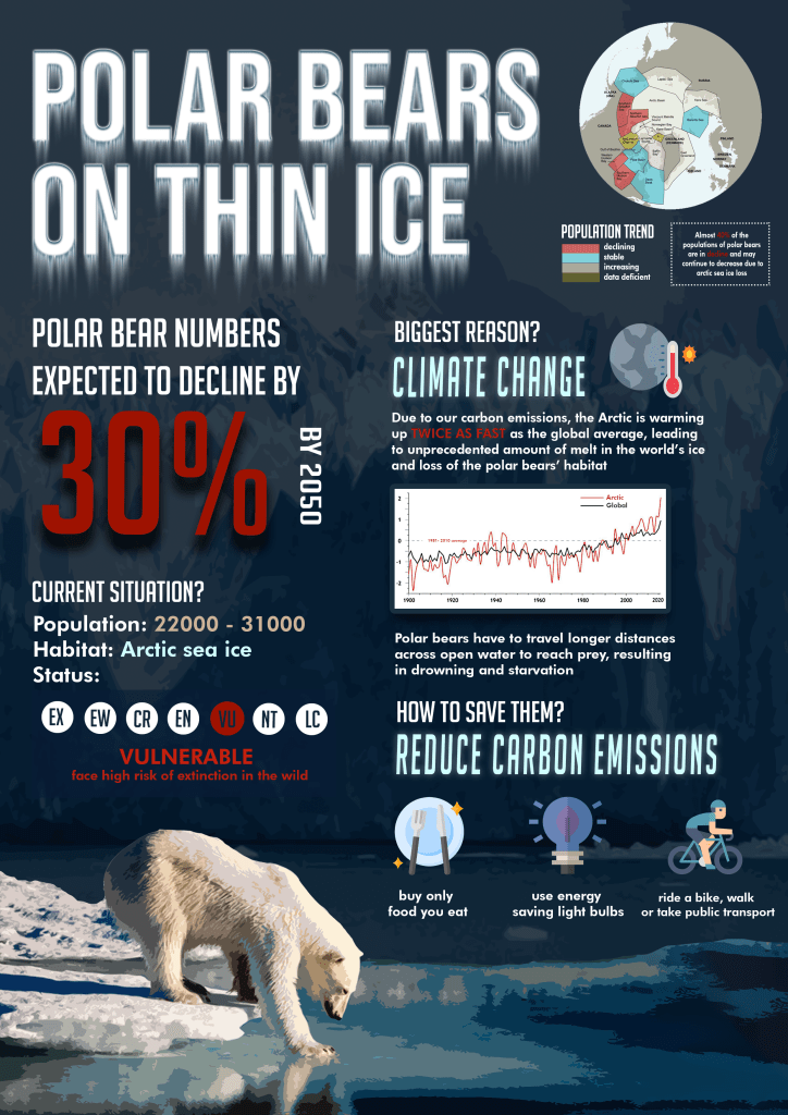
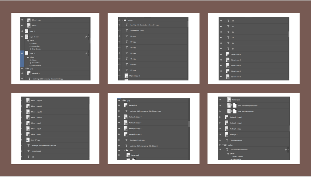
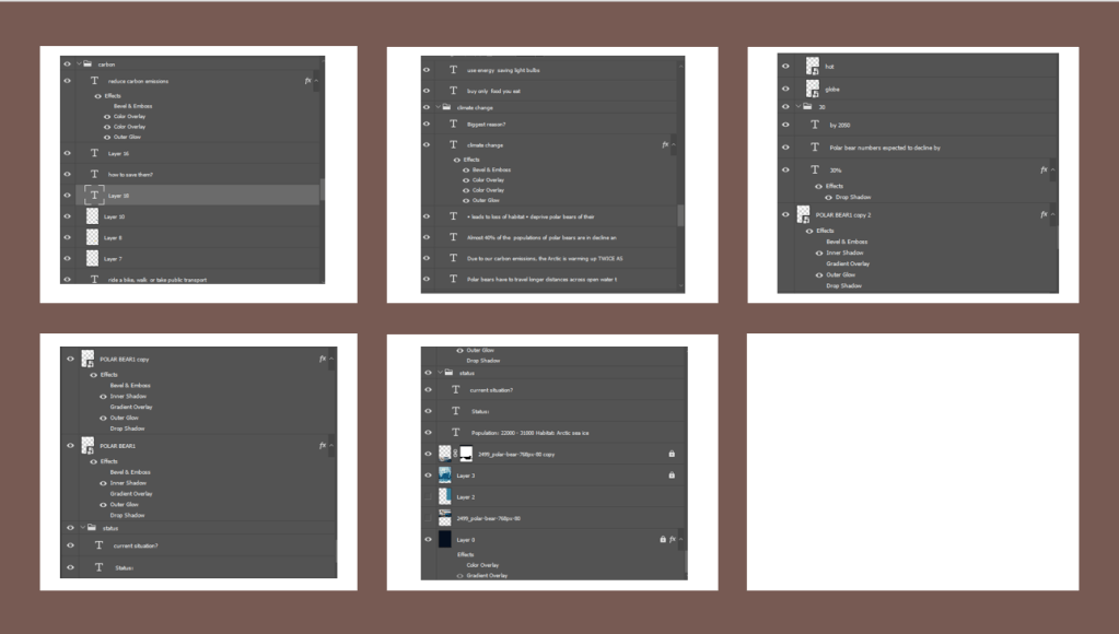
The following are the layers as requested, and you can see how I utilised Adobe Photoshop to construct this infographic.
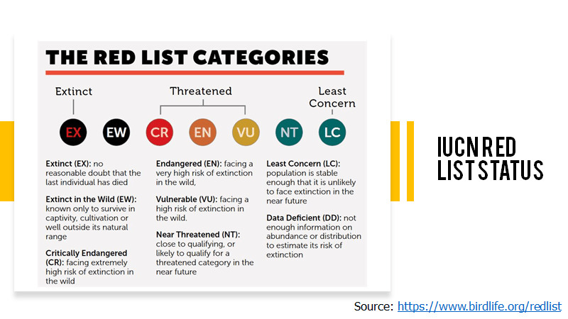
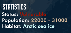
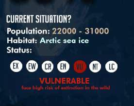
I wanted to reduce the amount of text that was in the infographic as I felt that it looked rather wordy after including more information, hence I decided to utilise the IUCN Red List to show that the polar bears are under the ‘Vulnerable’ status and shows where on the scale it is on, giving more information on its current situation.

FROM THE CRITIQUES, I HAD TWO OVERALL COMMENTS:
- Not enough link between reducing carbon emissions, climate change and the decline of polar bears.
- Jarring fonts of ‘Reduce Carbon Emissions’ and ‘Climate Change’
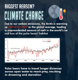
With the comments given, in order to tackling the problem of 1. Not enough link between reducing carbon emissions, climate change and the decline of polar bears, I decided to include more information with regards to the link between carbon emissions and the decline in polar bear numbers.
I decided to include a graph as suggested by Mr Kai En to show how the arctic is really warming twice as fast as the global average and to show the differences visually through this graph.
I also changed the text to make the connection more visible – one can see how the direct impact of not reducing carbon emissions can lead to polar bears dying of drowning and starvation and hence the decline of numbers.
This is the flow of information: Not reducing carbon emissions > Increase in global temperature, and especially arctic temperature > [shocking fact and graph to show severity] The Arctic temperature is warming twice as fast as the global temperature, which is not a good sign > Leads to the melting of the sea ice > Polar bears heavily relies on sea ice and it is their habitat > Results in a loss of their habitat > Polar bears have to travel way longer distances to reach their prey, leading to drowning and starvation.
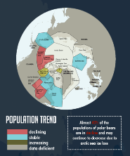
To make the information clearer, I also included a text to explain the population trend on the world map to give more context and relevance to how there is a decline in some populations of the polar bears.
As for the comment on the fonts 2. Jarring fonts of ‘Reduce Carbon Emissions’ and ‘Climate Change’, I changed the typeface that I used, using the same font that I used for the ‘questioning’ header of ‘Biggest Reason?’ and ‘How to Save Them’. To differentiate and make it less incompatible, I increased the text space between them and italized it. Hence, I omitted the use of the font RocketToInfinityW00, and only utilised two fonts in this infographic overall.
