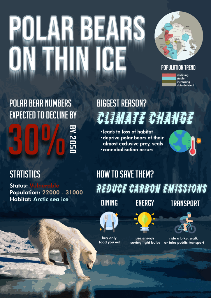
For the infographic, I wanted to focus on the main reason why polar bears’ numbers might shrink drastically (30%) by the year 2050 and raise awareness about climate change affecting the polar bears in a detrimental manner. I would also like the audience to understand the importance of making effort to reduce carbon emissions, and listed ways one can do their part.
The comments from the previous critique included the fact that I should focus on the cohesiveness, which is why I deviated quite a bit from my rough sketch as I wanted a cleaner and more organised look of the infographic.
FLOW: The natural flow I would like my audience to read in would be left to right in a downwards manner. I also positioned the bear to be at the bottom instead of the top and the center as it looked cleaner.
FONTS: I chose mostly block fonts to symbolise ‘blocks of ice’, especially for the headline. I used the filter of wind on the headline ‘Polar Bears on Thin Ice’ to emphasise the effects of melting ice, as a form of art element. I used BigNoodleTitling, RocketshipfromInfinityW00 for the headers and Futura Hv BT for the body text.
COLOUR SIGNIFICANCE: I utilised the colour red on specific words to highlight the decline of polar bear numbers, as the colour red stands out and signifies danger, and is especially utilised in warning signs. The dominant colour I utilised is blue, which is the colour of water (shows ice (white) melting into water (blue)). The infographic is also in mostly dark shades of blue to signify the seriousness of the issue and give off a depressive ‘vibe’ to the infographic.
ADDITIONAL COMMENTS: I omitted the information about other threats that could lead to a decrease in polar bear numbers (eg. pollution, disease, increased commercialised activities etc) as I felt that it did not directly link to the message I was trying to bring across, which is that climate change is affecting polar bears, and that we should take action.
EXPLANATION OF HOW I DID THE INFOGRAPHIC
I utilised the software Adobe Photoshop to help me construct the infographic. I first created a background layer [dark blue] so that it sets a tone for the entire piece.
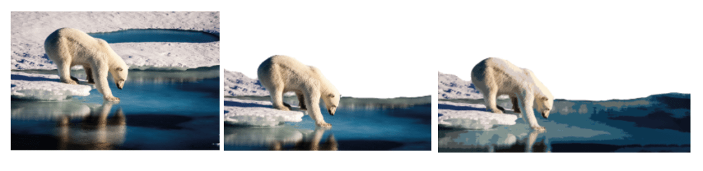
For the bear, I utilised the eraser tool to crop the portion that I would like to keep for the infographic. After that, I used ‘poster edges’ under the tab ‘filter gallery’ to create a more digital form of image of the polar bear and also content aware scale to stretch out the background of the water that is melting.
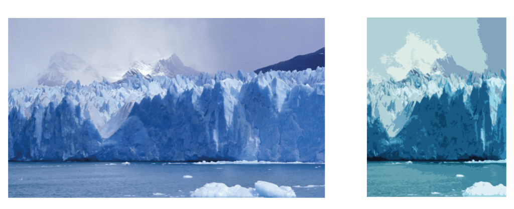
This is for the background. I toggled with the hues and saturations and played around with the Photoshop tools to achieve a more cohesive tone with the bear and background. I also cropped the image to use for the background, and tweaked the opacity so that it will not be too overbearing as the background image.
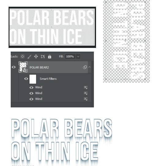
I first converted the words into a Smart Object and then rotated the text clockwise by 90 degrees, and under the ‘Filter’ tab, went to ‘Stylise’ and applied ”Wind’ 3 times. I then added all the other effects under ‘Blending Options’, which includes Bevel and Emboss, Inner Shadow and Outerglow.
COMMENTS CRITIQUE: [these were the comments given by my peers and Mr Kai En]
Sneha: I really loved the background design, it really supported the message that you were trying to get across! I did feel that the design of the text used for “climate change” and “reduce carbon emissions” can be swapped because it takes away attention from the other titles, it takes a while for the audience to see the links between the message and the call to action. I think more information on the decrease would help, like by showing the connection between pollution and climate change then linking it to the decrease in polar bears. Overall good job!
Kai Jing: I think the population trend could be made bigger! Maybe don’t need to show the whole globe, you can enlarge it and place it at the corner. But I am not sure if this would create imbalance to the overall. And I think the alignment of the reduction of carbon emission is okay! [when I was trying it out, there were issues with regards the imagery that I pictured!]
Also I think there can be more information. The current information doesn’t really value add to current common knowledge, and I don’t really see the link between how we can do something to slow down climate change. Maybe can explain more about climate change, that it is raise in temperate and melting of ice that causes the stuff that you mentioned! So readers can see a clearer link in how saving energy reduces carbon emissions (which is linked to climate change).
Amanda: I think the illustration of the polar bear is really nice and the overall color scheme works! I think this is a topic with very impactful and shocking numbers regarding the decline of polar bears and I like how you made the statistics very striking to capture the audience’s attention. However, I think the font colour for “30%” and “vulnerable” is a little too dark. Perhaps you can make it a little more contrasting with the background so that it is even more striking. Also I think the “population trend map” can be blown up a little bigger! Overall, the flow of information works really well and the visuals work well to support the information and statistics! Jiayous!
Mr Kai En: Sneha and Boon Jing hit home with their comments, and I am of the same thinking with what they had mentioned. Overall the visual is working well, but the communication of the infographic needs to be tightened further – look into how else to incorporate further data or insights to help add value to this piece of work (Sneha suggested a showcase on the decreasing number – I think that would help and perhaps you could use a chart to showcase dwindling numbers). Also, while I appreciate the dynamism of the typeface used for “climate change” and “reduce carbon emissions”, I am not sure if they are quite working as I feel that it can be rather distracting to the whole composition and that it stands out in a jarring manner 🙂
