For this exercise, we were given a typography case study and this was the image presented.
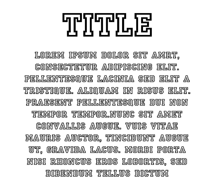
- What seems to be off about this particular typographic representation?
- The header and body has the same font, and this results in a less visually appealing look as there is no complementary typefaces being utilised here which does not enhance the quality of each other, and there is no variation in the fonts to contrast the design.
- The body text is center aligned and this affects the readability of the text as there is no consistent starting point.
- The body text is in all capital letters, which may be difficult to read and capital letters are usually utilised for headlines and not body text that may be lengthy.
- How would you improve this typographic representation (look into the 8 rules for guiding points for discussion)
- Rule 4 Readability: To change the alignment of the text to be left-aligned instead of centre
- Rule 6 Hierarchy Matters: Utilisation of different fonts for the header and body text to guide the reader to read the text from top to bottom
- Rule 3 Typeface Communication: Changing the font of the body text to one that is not completely capitalised, and one of sans-serif.
